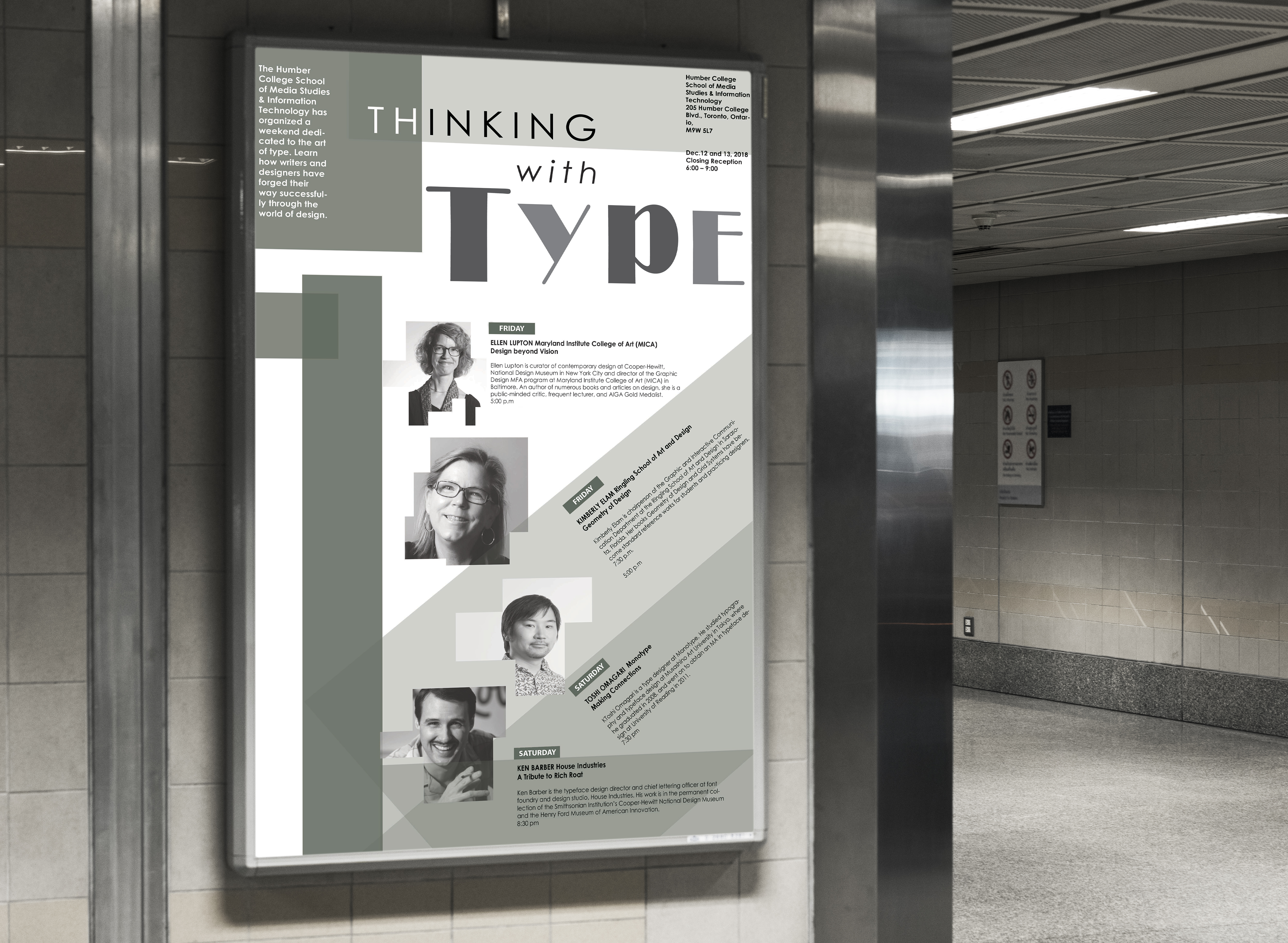
This project was done for Humber college for an event. I experimented with Geometry and Typography to create an impactful design. I wanted to keep this in Grayscale to make it a bit serious. Having different shapes and making it colourful might have made it a bit distracting. I found this more interesting in grayscale


